Why Colour Contrast Matters
Colour contrast is crucial for readability and usability, especially for travellers with visual impairments. Here’s how we approach this in our design:
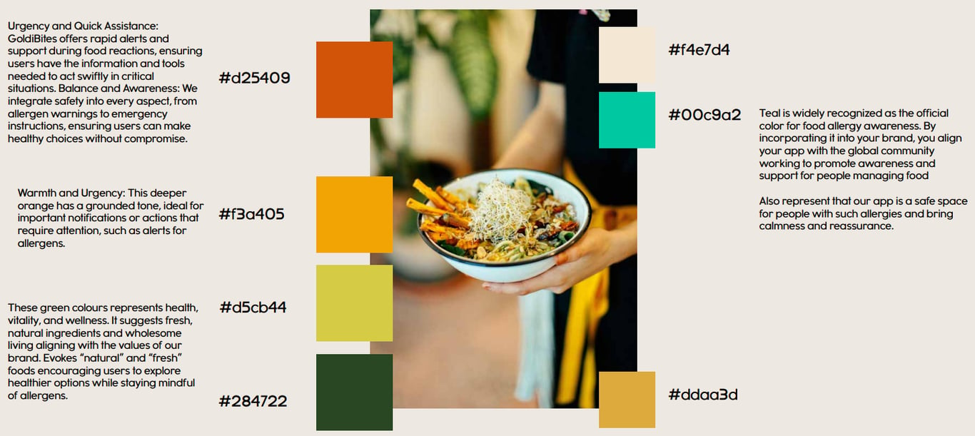
Enhanced Visibility: We carefully selected colour palettes that not only reflect our brand but also ensure that text stands out against backgrounds, making information easy to read.
Guidelines Compliance: Our design adheres to WCAG (Web Content Accessibility Guidelines), ensuring our app is accessible to the widest possible audience.
User Testing: We conducted user testing with individuals to ensure our colour choices meet accessibility standards.
Colour Contrast Checker
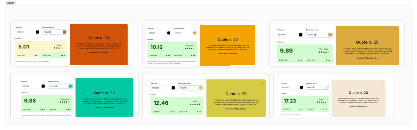
By prioritizing accessibility and colour contrast in our design, we’re fostering an inclusive environment where everyone can safely navigate their food options.